Dashboard
The Dashboard is the first page of Zenarmor and allows you to view the most critical network activity at a glance.
During Zenarmor's development, we did our best to use everyday plain English and explicit texts on the UI. If you're familiar with your home router's management user interface, you may feel home :)
To view the Dashboard, in the OPNsense GUI navigate to Zenarmor → Dashboard.
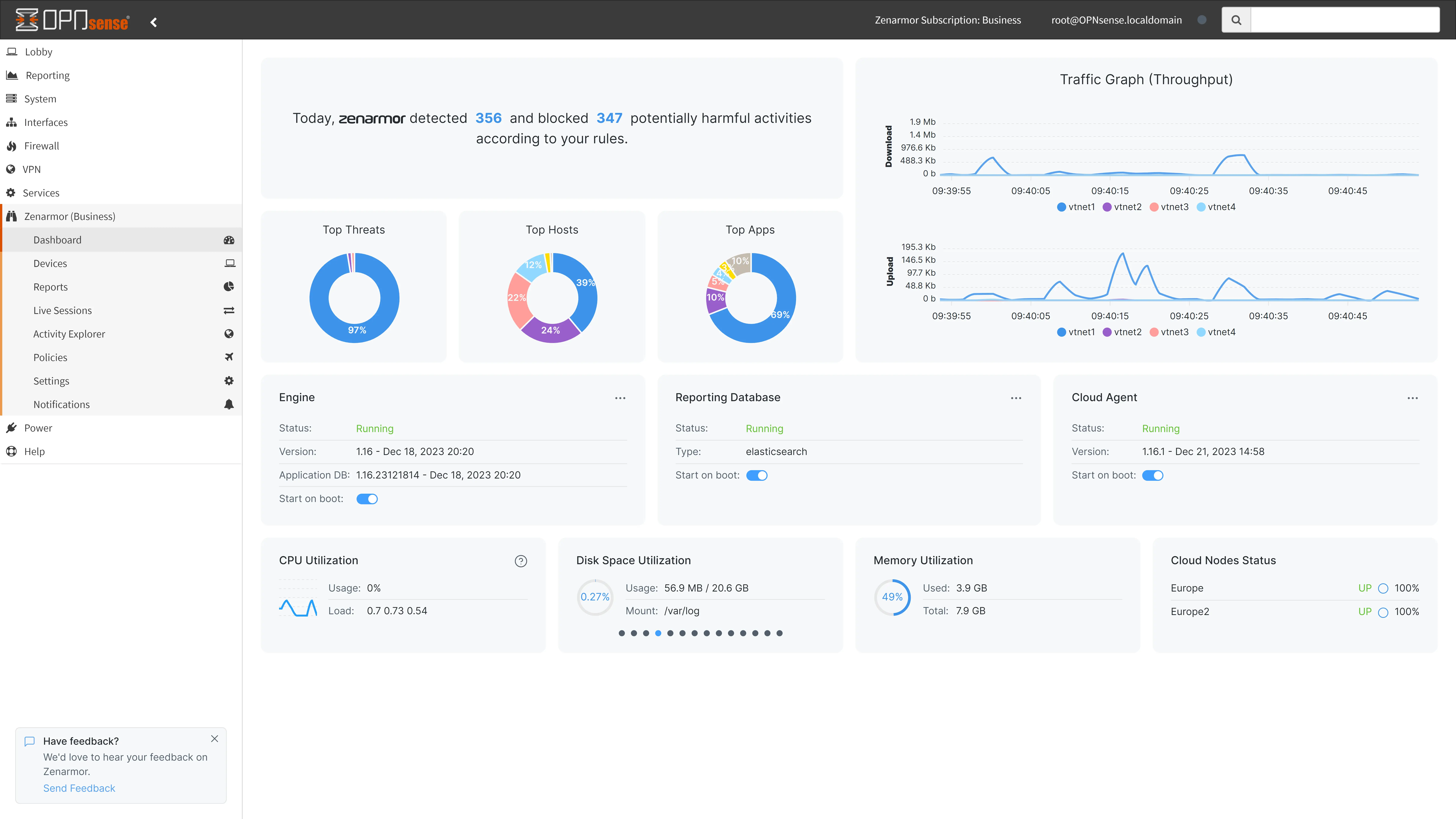
Figure 1. Zenarmor Dashboard
Dashboard Components
The dashboard consists of the following areas:
Notifications Bar
When the application database is updated automatically or an update is available for the engine or subscription status is changed, notifications are displayed on the bar.

Figure 2. Notifications on the Dashboard
Updating Engine
When a new engine version is available, you will see a notification on the bar. You can view the Release Notes for the latest version by clicking on the Release Notes link.

Figure 3. Update Zenarmor Engine Notification
To update your engine just click on the Update to link on the notification bar.
Threat Summary Pane
You can view the total number of detected and blocked network security threats on your network in the last 24 hours according to your policies.

Figure 3. Threat Summary Pane
A Threats Lives session explorer, which exhibits all identified and blocked threats, can be accessed by tapping on the numerical values in this pane.
Traffic Throughput Graph
Zenarmor dashboard provides you with an easy-to-read and interactive network usage graph. You can monitor network traffic throughput of protected interfaces in real time. Throughput is displayed for both incoming and outgoing traffic. The last 20 throughput values retrieved from the node are displayed.

Figure 4. Traffic Throughput Graph
You can select the metrics used to view traffic throuhgput. Do you want to see how many packets are transmitted, or the number of bytes transferred? You can select which information you want to see here. Available throughput metrics are as follows:
- Packets: Number of packets per second
- Volume: Number of bytes per second
Default throughput metric is Volume. To select a metric for your throughput graph, hover your mouse over the top right corner of the pane this will display the available metics. And then select the metric, such as Packets.
Viewing Network Throughput at a Specific Point in Time
To view the network throughput at any point in time, hover your mouse over the line on the graph as shown in the next figure.

Figure 5. Viewing traffic throughput at a specific point in time
Interface Filtering on the Traffic Throughput Graph
If you have more than one protected interface on your node, you will see the network throughputs of multiple interfaces simultaneously.
However, you may want to focus on the throughput of one/some of the interfaces.
To view the throughput of a single interface, hover your mouse over the interface name at the bottom of the graph. This will display the selected interface's throughput for several seconds on the graph.
")
Figure 6. Filtering an Interface (igb1_vlan100 interface filtered on OUT)
You may also exclude one or more of the interfaces by clicking on the interface name(s) at the bottom of the graph. This will remove the selected interface line from the graph.
")
Figure 7. Excluding Interface (igb1_vlan100 and lagg0_vlan20 interface are excluded)
Top Pie Charts
You can view the following 3 Top Pie Charts:
-
Top Threats: Top (Top 5 and others) blocked security threats on your network for the current day. You can view the details of these threats by hovering your mouse over the pie chart.

Figure 8. Top Threats Chart (8 Parked Domains sessions are blocked, for example)
-
Top Hosts: Top (Top 5 and others) hosts which have the highest network bandwidth usage for the current day. You can view the details of these hosts(hostname/IP and its total bandwidth usage) by hovering your mouse over the pie chart.

Figure 9. Top Hosts Chart
-
Top Apps: Top (Top 5 and others) applications that have the highest network bandwidth usage for the current day. You can view the details of these applications(Application Category and its total bandwidth usage) by hovering your mouse over the pie chart.

Figure 10. Top Apps Chart
Services Status
You can view the status of the Zenarmor-related services on the dashboard. It provides all the critical system-level information you need to manage your node. The following services are listed here:
-
Engine
-
Reporting Database
-
Cloud Agent
-
Cloud Nodes
")
Figure 11. Services Status(Engine, Reporting DB, Cloud Agent)
")
Figure 12. Services Status(Cloud Node Status)
You can check whether one of the services is running or not by viewing the related pane on the dashboard.
Also, you can start, stop and restart the Zenarmor-related services by clicking the management buttons on these panes.
For more information, please refer to Status.
System Utilization
You can view the following system (node) level information on the dashboard:
-
CPU Utilization: The real-time CPU usage is displayed on this pane. You can view CPU usage percentage and CPU load.
-
Disk Space Utilization: Zenconsole displays disk utilization separately for each partition on the platform. The utilization of each partition is automatically displayed in a slide show. You may also navigate between the partition utilizations by clicking on the sliding icons at the bottom of the pane. You can view the following information:
-
Total disk usage of each disk partition
-
Total size of each disk partition
-
Usage percentage of each disk partition
-
Mount point of each disk partition, such as
/,/tmp, or/usr/local.
-
-
Memory Utilization: Real-time memory usage is displayed. You can view the following information:
-
Total memory of the system
-
Amount of Used memory
-
Usage percentage of the memory
-

Figure 13. System Utilization