Radically simple
One clear message per screen, one primary action, no jargon the reader has to decode.

Every rule on this page, from a single color to a button label, serves one idea: protection that feels calm, clear and within reach.
One clear message per screen, one primary action, no jargon the reader has to decode.
Security is serious, so we sound steady and precise instead of alarming.
We show real numbers, real product screens and real limits. We never oversell.
The Zenarmor logo pairs an orange mark with a navy wordmark. It is our most recognizable asset, so always use the original files and never a redrawn or recolored version.


Keep two-thirds of the logo's height free on every side: 16px when the logo is 24px tall.
The full-color logo in the site header.
The reversed logo in the site footer.

A white, open page with one blue for action and one orange for the brand. Navy gives depth. Select a swatch to copy its hex value.
A typical page is mostly white and gray, with dark text, a few blue actions and a single orange moment. If orange starts to dominate, the page stops feeling calm.
| Sample | Pairing | Contrast | Use for |
|---|---|---|---|
| Aa | Ink on Paper | 17.3:1 AAA | Headings and body copy |
| Aa | Paper on Deep Navy | 18.8:1 AAA | Text on navy sections |
| Aa | Deep Navy on Orange | 7.85:1 AAA | Text on orange |
| Aa | Accessible Blue on Paper | 5.15:1 AA | Links and colored text under 24px |
| Aa | Gray 4 on Paper | 4.85:1 AA | Secondary text, captions |
| Aa | Action Blue on Paper | 3.06:1 Large only | Text 24px and up, icons, borders |
| Aa | White on Orange | 2.46:1 Avoid | Use Deep Navy on orange |
Large text means 24px and up, or 18.66px bold. Button labels at 14–16px don't count as large, so set small colored text in Accessible Blue (#006BD6).
$color-error$color-successAlways pair a status color with a word or an icon: the green and the red differ mainly in hue.
Plus Jakarta Sans carries both headlines and copy, which keeps pages warm and readable. Roboto Condensed adds a technical edge in small uppercase labels.
Headlines and body copy. Bold for page titles, semibold for section and card titles, regular for reading, medium for buttons.
$font-body · 400–700Uppercase eyebrows and small labels above a title. Never for paragraphs.
$font-heading · 400–700Form input values and interface details.
$font-ui · 400–500A rare serif accent for one emphasized word or a pull quote.
$font-display · 400–600Radically simple network security
Unified network security
Why teams choose Zenarmor
Deploy in minutes
Local-first protection
Block threats, filter the web and see every device on your network from one console.
Zenarmor inspects traffic on the device itself, so policies keep working when the cloud connection drops.
Prices exclude VAT. Billed annually.
Simple line icons explain features at a glance. They share one drawing style, so a page of twelve icons still reads as one family.
Rounded outline icons with 1.5–2px strokes at display size.
Action Blue for features, Gray 4 for benefits, orange for one accent.
20px inline, 24px in lists, 40–56px in feature cards.
Use an icon from the set. Emoji don't appear in UI or marketing copy.
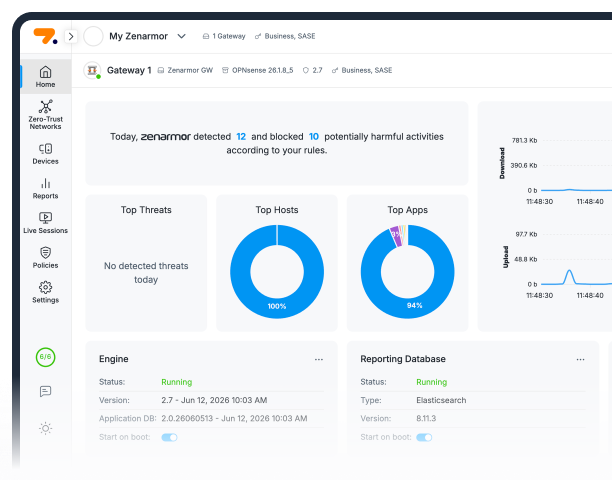
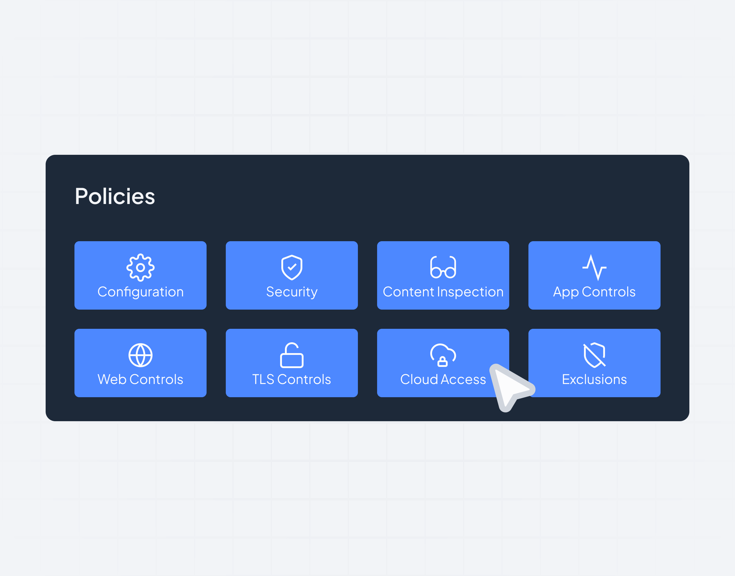
We show the product, not stock photos of hooded hackers. Hero images are real console screens, or simplified UI compositions built from console elements, on a light ground.
We write like a senior engineer explaining something to a smart colleague: plain words, short sentences, the benefit first. Our voice stays the same; our tone shifts with the moment.
Everyday words over acronyms. Explain a term the first time it appears.
Short, declarative headlines. One idea per sentence.
Lead with what the reader gets, then how it works.
No fear tactics, no hype words, no exclamation marks.
Product and partner names keep their own casing, even at the start of a sentence.
| Say | Means | Don't say |
|---|---|---|
| Organization | The customer's tenant in Zenarmor. | Account, workspace |
| Gateway | A network deployment that Zenarmor protects. | Node, instance |
| Endpoint | The Zenarmor agent on a user's device. | Client, node |
| Device | Any host a gateway sees on the network. Not an endpoint. | Endpoint, for a seen host |
"Zenarmor" is our business name as well as a trademark for our goods and services. When you refer to the company by name, use "Zenarmor" as a noun without the ® symbol, for example: "Zenarmor unveiled a new line of products."
You may not change or modify any Zenarmor trademark or logo without Zenarmor's explicit consent.